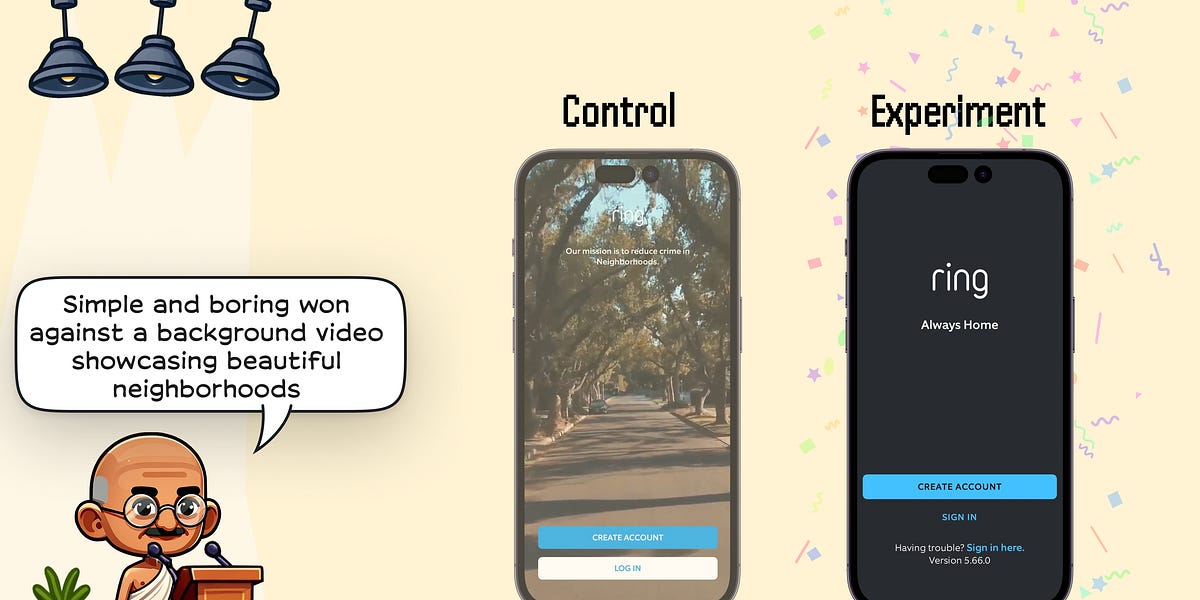
👵 Use boring sign-up screens

🌈 Abstract
The article discusses the tradeoff between functional and delightful designs for sign-up screens, and presents the results of experiments conducted by several companies, showing that functional (and "boring") designs performed better than more visually engaging designs.
🙋 Q&A
[01] Sign-up Screen Designs
1. What is the difference between functional and delightful designs?
- Functional design emphasizes practicality and usability, ensuring the product performs its intended functions efficiently and effectively.
- Delightful design goes beyond functionality to create an enjoyable and emotionally engaging user experience, aiming to evoke positive emotions and make a lasting impression.
2. What were the results of the sign-up screen experiments conducted by the companies?
- In the first three experiments, a functional and plain design for the sign-up screen won against enjoyable and emotionally engaging videos.
- In the Spotify experiment, adding an illustration to an otherwise plain and functional sign-up screen was enough to hurt logins and registrations.
3. Why do the author think functional designs perform better on sign-up screens?
- Distracting users: Adding illustrations and background videos to the sign-up screen can distract users from the CTAs, reducing the likelihood of them signing up.
- Bandwidth and app size: Additional elements like videos, illustrations, and animations can materially increase the app size, reducing the likelihood of users in countries with slower internet successfully downloading the app.
4. What does the author recommend for the next experiment on the sign-up flow? The author recommends trying "boring and functional designs" for the sign-up flow, or taking inspiration from prior #First1000 issues on how to further improve sign-up screens.